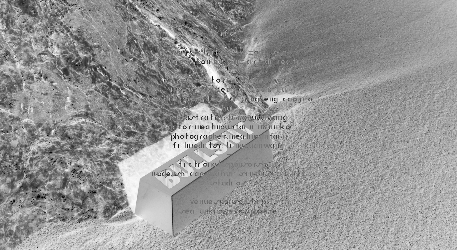
2021年是中国的牛年。2M2 Art Direction Co.,舒曼艺术指导受邀为在线美学平台maltm.com 设计一款新年礼物。
“BULLSHIT” is a present that 2M2 Art Direction Co. designed for 2021, the year of Ox in China.
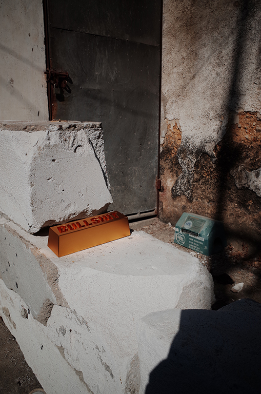
牛在中国是勤劳和财富的象征。牛市喻意着好的股市趋势,但它的谐音是牛屎_Bullshit。
In traditional Chinese culture, the characteristics of an ox are hardworking and wealthy. Meanwhile, the bull market means is a rising trend in the stock market. This character of an ox implies multiple layers of goodness.
中文有一句谚语:鲜花插在牛粪上。已经过去的2020年有过太多魔幻而悲伤的回忆。新的一年,是牛市还是牛屎呢?没有人知道。
There is a colloquialism in China, a bunch of flower in bull dung,it means such a waste. However, it was hard to figure out what means waste in 2020. Many of our essential needs became a luxury. This golden “BULLSHIT” brick, carries our aesthetic and multiple expectations for 2021.
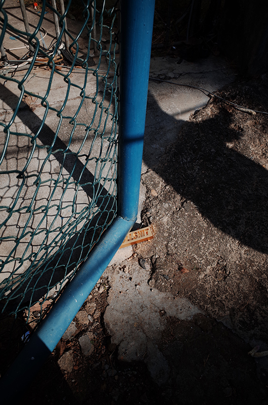
2M2 Art Direction Co.,舒曼艺术指导希望以轻松的方式来迎接新的一年,以及各种未知的挑战。他们用一种诙谐的方式来回应“鲜花插在牛粪上”这句谚语:用Bullshit(牛屎)这个单词制作了一块金砖,这样,这个礼品,就包含了牛市以及牛屎的双重含义了。
2020 was the year of chaos, it was a global crisis. There were too many hopeless moments. It hits individuals from heart to soul. In this case, 2M2 wants to present a humorous and lightening tone for the following year. There are too many unknowns in the future. We design a piece of golden “BULLSHIT” to present our expectations for 2021.
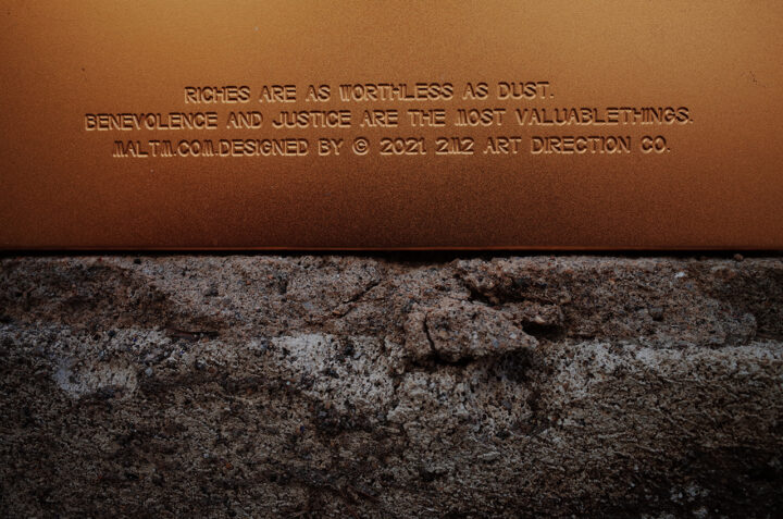
Bullshit字母在金砖的内部凹陷,在T字的内空,隐藏着一个小孔:它可以用来插花,或者点燃香薰。在金砖的背面,镌刻着一句经典的劝诫语:钱财如粪土,仁义值千金。
In the inner space of the letter“T”, there is a small hole that can hold slim stuff. we don’t want to limit the use of the product, you can hold anything you want on this piece of “BULLSHIT”. One can use it as a vase or an incense holder. On the backside of this piece of “shit”, we debossed a cliche, yet works well, “Riches are as worthless as dust. Benevolence and justice are the most valuable things.”
它像是一句调侃,当你对生活充满希望时,或者失望时,它仿佛都在说,Bullshit.
This piece of “shit” represents our optimism when we facing loss, troubles, disappointments, or sorrows. It tells you that everything is bullshit.
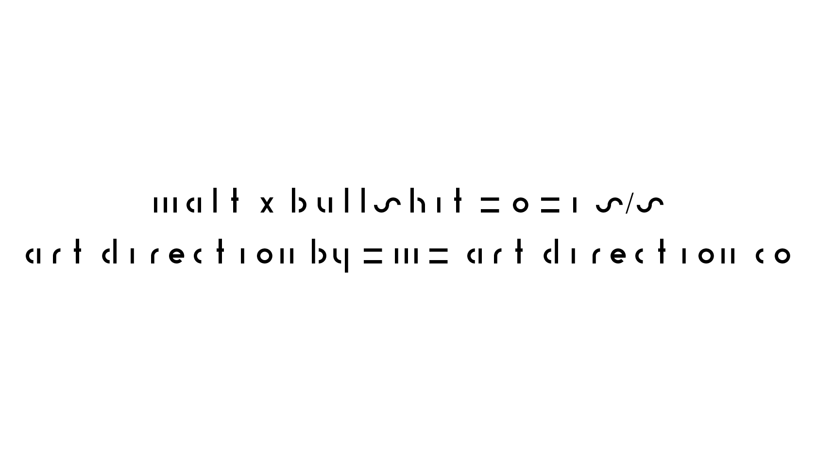
2M2 Art Direction Co., 同时为 maltm.com 开发的品牌专属英文字体,新的字型将应用在产品的平面、海报以及包装上。
This project also reveals a new typeface we designed for Malt.

金砖背面文本的字体规划的是Helvetica,2M2 Art Direction Co.,希望用严谨而中性的Helvetica来强调生活的荒诞而不可捉摸。当他们交付给工厂时,由于工厂缺少字体,而换成了一个非常卡通的字体。
WE LIKE THIS BULLSHIT FONT!
Originally, the typeface we chose for the backside of this piece of “shit” was Helvetica. Even though it is a cliche typeface, yet the functionality and classical beauty are unignorable. We, 2M2 want to use the cliches to contrast with our chaotic reality.
However, as with all the life lessons, things always happen. When it comes to the actual production, the factory doesn’t have the typeface. Instead, they change it into a cartoony typeface. This funny behind the scene story perfectly illustrates our concept for this project. We embraced this bullshit typeface with our bullshit attitude.
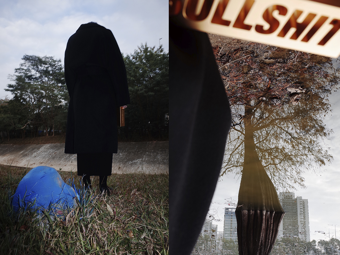
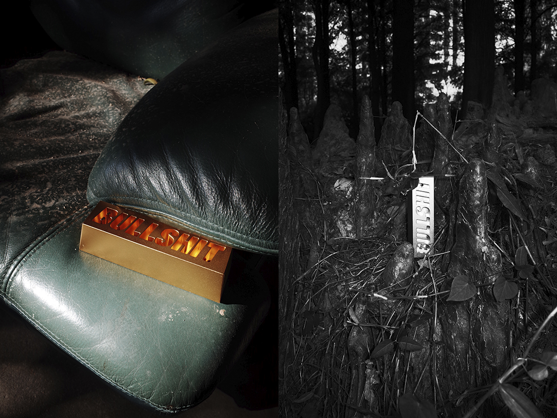
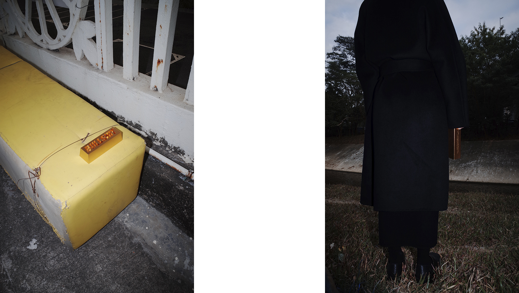
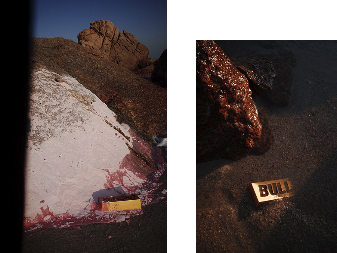
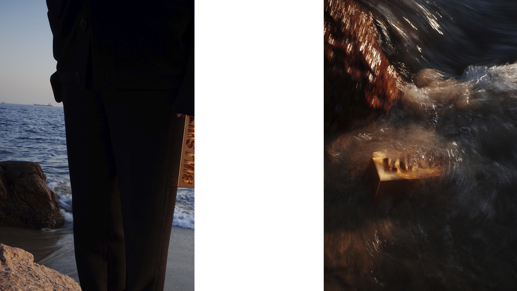
2M2 ART DIRECTION Co.,舒曼艺术指导与摄影师一起制定了摄影策划案:将 Bullshit 金砖置于各种场景:林间,荒废的工地,沙漠,海洋,以营造出一种强烈的魔幻现实主义效果。
For the photographic direction, we set multiple scenes to emphasize our concept of juxtaposition in this whole project.

INFO:
____
MALT X BULLSHIT 2021 S/S
Client _ Maltm.com
Service _ Art Direction / Production
Design At _ 2M2 ART DIRECTION
Art Director _ Michael Wang
Design Director _ Long Lei
Graphic Design _ Long Lei / Cai Jingfeng / Cao Jiahui
Typography _ Lingyuan Wang
Photography _ Meatmountain
2021